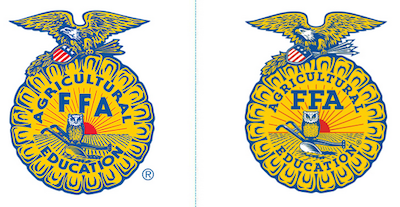
 The National FFA Organization’s website got an overhaul giving it a fresh, clean new look. This also lead the FFA to think about updating their brand and the FFA emblem is the center of that. The old emblem format was out-of-date and caused problems in digital production efforts.
With approval from the National FFA Board of Directors, FFA staff began a process to update the mark with a clear intention of preserving the elements and emotion that the mark has long held. The goal was a final product that both reflected the heritage of the FFA brand and was capable of reproduction in perfect quality, every time.
You’ll notice that the refreshed emblem has been digitally enhanced to highlight the crisp, well-defined eagle, shield, arrows, owl and plow. On the eagle, the wings have been made symmetrical, while the the kernels of corn and rays of sun are new equally proportioned.
Over the next year, you’ll see the new mark deployed in more and more places. It will make its way to the FFA jacket with an accurate, more vibrant stitched embroidery, and will also begin to appear on other Shop FFA merchandise.
The emblem will also be more accessible for those who desire to use it non-commercially through the new FFA Brand Center on the redesigned FFA.org. There you’ll find a comprehensive set of downloads and guides for how to best display it in a way that illustrates the tradition and pride in the mark.
Find a detailed description of the changes to the FFA emblem on the National FFA’s Official Blog.
