![]() AGCO has “refreshed” their logo. This is the new one. Why? Well I’ll let them explain:
AGCO has “refreshed” their logo. This is the new one. Why? Well I’ll let them explain:
Martin Richenhagen, President & CEO comments, “The objective is to modernize the design of our corporate logo – without compromising the positive recognition that our triangular ‘farm field’ logo enjoys around the world. The refreshed logo reflects our position as an innovative global leader providing ‘high-tech solutions to professional farmers’.”
The new design also represents thinking “out of the box.” Quite simply, the box lines are being eliminated and the orange color is now a red-orange that is more bold and distinctive. The new color unites AGCO’s proud heritage (in the traditional orange of AGCO Tractor products) and the continuing success today (in the “hot” red of Massey Ferguson products). AGCO developed this new look through a cost-effective process using AGCO’s internal design and brand-marketing expertise.
 Just so you can compare the two. Here’s what the “old” logo looked like. It looks like they’ve got some good in-house talent so why not put them to work?
 Now let’s say you’re stationed in a foreign country, in a desert-like environment and all you’ve got to eat is your basic MRE’s. What would you give to have a nice bowl of salad with a little ranch dressing? How about $2.9 million dollars? That’s what
  I don’t know if you’ve heard about this but it’s a new one on me. It’s
 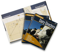 A new 74-page directory of dairies in the Southwest is now available. It’s called the
  I’ve been wanting to write about this. Heck, I’ve been wanting to eat one of these! Is it only a guy thing though? Hat’s off to the Beef Checkoff for teaming up on a huge promotion like this. I wonder what the results will be? Besides a
  No audio with this post. Just pointing you to an interesting article on
  This week’s CornTalk, a program of the